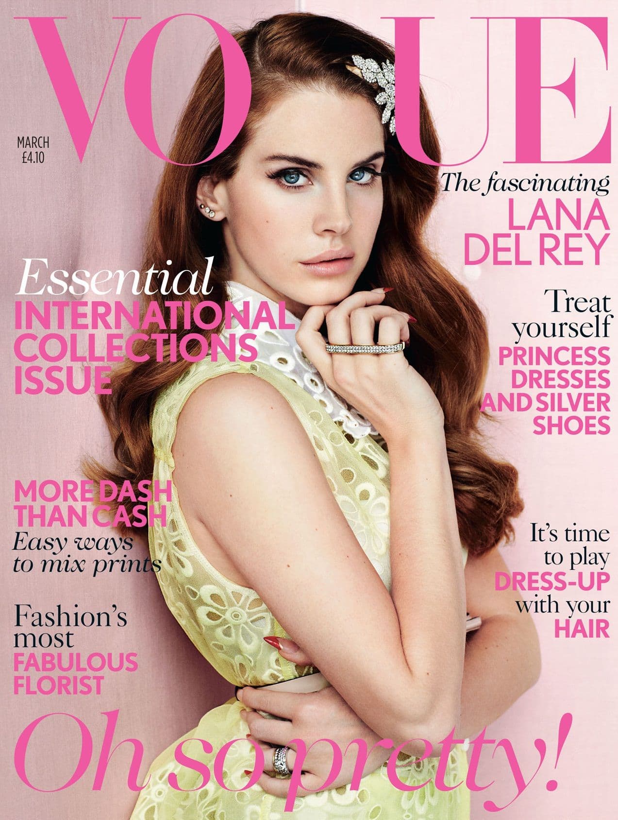
Masthead
The name of the magazine is large and bold, in a serif font, immediately drawing the eyes attention. Furthermore the masthead is part of the house style as it is consistent with every issue. The visual style of the magazine is aesthetically
pleasing and compliments the celebrity photo. It is clear that a particular colour scheme has been used - pink - and
it therefore creates the feel that it is predominately aimed at women. The use
of words on the cover such as ‘princess’ and ‘pretty’ also
re-enforces this. Furthermore, due to only 3 different types of texts makes
it clear and not too overwhelming. By only making some of the text bold or italic, it highlights certain words first, for example, 'Essential' leads the reader to view the magazine as having information that they desperately need. Also, it grips them to look at the whole cover, tempting them to buy it in order to read it all.
Colour Scheme
The overall theme of the cover is pink, with added texts of black and white. This creates a "pretty" look, that matches the look of the celebrity - Lana Del Ray - because she is wearing a flower dress and flower head piece. Furthermore, the yellow dress compliments the light pink back ground and her auburn hair contrasts it so that it stands out. Lastly, the darker pink colours of the text also stand out against the light pink to give a playful and light feel.
Main Image
The main image is known to be the largest in the magazine. It is bold and the model celebrity is angled perfectly to attract the most attention. For example, Lana is looking straight, although her body is angled differently - this has been done so it appears that she is looking into the readers eyes, compelling them to make a purchase.
Text
The text has been placed around the image, almost in the way her body is, to leave the majority of her uncovered, therefore making the image stand out more. The margins of the cover are all the same, giving a professional and clean look. Furthermore, the alignment of the text has been edited according to which side it sits on, which also makes it look cleaner and easier to read - far more effective. The left third of the magazine cover displays articles inside that will be easy to show when in shops, it also holds the 'VO' of the masthead that is instantly recognisable as the serif logo for Vogue.
Function
The content of the magazine is targeted to a specific audience - predominately women. This is shown by the use of words and what articles are inside. For example; 'It's time to play dress up with your hair' - consequently it highlights an article that women may be interested in, resulting in a higher chance of buying the magazine. The cover also credits Lana Del Ray, indicating that there is also an article on her - this is a selling point in itself because fans of the singer will want to buy it.
Dateline
The month of the issue has been included on the cover in small text - important for shops to check if its up to date and for any who collect the magazines. The price of the magazine has also been included below the month - the small print is used so it does not to detract from the main featured of the cover, but is mentioned as it is important for the customer or reader.
No comments:
Post a Comment